Wednesday, June 15, 2011

A Trip To National Museum

Cave Painting / Lukisan Gua

What so interesting about this is that....People from century ago already start finding way to mark them-self in the future. What they paint is telling story of maybe a war between tribe and so much more to be explore. Well there are also different art style?? if you goggle "Cave Painting". There are Egyptian, Asian, and so on.... Much to explore, much to preserve.


From The Beginning of Life on Earth

(Correct me if I'm Wrong)
From the very beginning. Earth it self only have 1 continent and 1 sea. After a decade... Where earth go through some changes. Earthquake, natural disaster and it slowly separate the earth into different continent and this is what we get today. So what if the earth still 1 ? Will we have just 1 language ? 1 currency ? 1 skin color ? of course that is out of topic...

Tuesday, January 18, 2011

Layout (a.e.i.o.u Studio)

Art stlye is basically follow back at their original website art style. They uses black stroke, i indicate into my design. I havn't add color.

As for the Home page. I added a big promotion banner where user will see when they open log into the website. Also have some tab. Which is New, Tips and Event. Where user can click and will direct the user to the page linked.
New, where the page showing New Product
Tips, video on how to wrap a present?? how to decorate a present with ribbon and so on...
Event., up coming event


In the Product page. there will be a moving panorama moving side way with the hottest item on the market. This will tell user which item have the most people bought. Also there will be a side category bar where user can choose the category and view the picture according to the category chosen.

Strategic Brief & Mood Board

Project Definition:
To redesign the a.e.i.o.u Studio website. To help enhance the website by improving own their design, interaction flow and usability.

Current Site Analysis Goals:
Currently the website is just give a little information on what the Studio is about. And also show casing some of their product. User also able to get "Up Coming Event" from this website too.

Client's Analysis:
Is a gift products company that sell wide range of items. From: Boxes, greeting cards, wrapping paper to so much more.

Target Audience:
Young adults 14-21.

Competitor's Analysis:
-Design on their website mostly towards clean layout
-News product will be on the main page
-Categorize neatly in the product page

Idea & Concept Implementation:
Their art style is pretty good, it just that they didn't use that art style throughout the website. Will be using their art style to redesign the website.

Remove the splash page, and change it to a Promotion Page. Where there are promotions, sales, top product. Will be on the 1st page of the website.

In the product page. Create a side category and picture will be show in the middle of the page.

"Point of Purchase" will be change to "Where To Buy"

________________________________________________________________________


Mood Board

Sunday, January 9, 2011

Beautiful Commercial Website

BEARBRICK
http://www.bearbrick.com/index.html

The artstyle of this website is certainty very unusual because of the influence of the product. There are options to change the language, but the position of that is a little bit weak. Interaction flow is clear, button is clear. Product page, show a big picture of the product for user to see.


________________________________________________________________________


Crocs
http://www.crocs.com.my/index.php

Analysis:
The design of the website is clean cut, looks like very professional. They also applied the idea of "above the fold" and "under the fold". Just need to add some roll over effect on the some of the button, it will be much better. Usability is good


________________________________________________________________________


Baskin Robbins
http://www.baskinrobbins.com.my/

Analysis:
Pretty fun website, interesting design on navigation button. With alittle movement on some of the graphic, make the website more attractive. Roll over effect also play an important role in this website. Flow of the website is smooth.


Website Photoshop Tutorials

1.)http://www.hv-designs.co.uk/2007/10/10/web-design-layout-2-tutorial/


2.)http://www.talk-mania.com/web-layouts/42842-photographer-layout-portfolio-layout.html


3.) http://www.hv-designs.co.uk/2008/03/18/funky-web-design-layout/


4.) http://www.talk-mania.com/web-layouts/37340-urban-layout-perfect-web-design-company.html

HTML Tutorials

1.) This teach how to create a Menu Bar
http://www.dynamicdrive.com/dynamicindex1/ddsmoothmenu.htm


2.) This teach how to create a more instresting design of scrooling
http://www.dynamicdrive.com/dynamicindex2/sagscroller.htm


________________________________________________________________________


HTML Tutorials Website

1.)http://www.tizag.com/htmlT/

2.)http://www.htmlcodetutorial.com/

3.)http://www.w3schools.com/

Competitors Website

http://www.superiorgiftwrap.com/

Superior GIFTWRAP

Analysis:
The white space is too much in some of the page, will affect the user thinking the website is too empty. When the user click into a product. The page is totally different than the home page. But this website clearly show the design of the wrapping paper.


________________________________________________________________________


http://www.papermart.com/
Paper Mart

Analysis:
The color is quite unfamiliar to me. I personally think the website is weak. With no typo treatment, and the arangement of the Layout is very messy. The side, when the page is long enought, when scrooling down it will follow the scrooll bar as you scroll down. Is a pretty usefull tricks, but I think they use it in the wrong way


________________________________________________________________________


http://www.noblepackaging.com/

NOBLE Pakaging

Analysis:
Because this website is a international website. When a use go into the website, it ask the user to pick 1 out of 3 country to change the currency of the prize. User friendly website, user know where to click, where to go.


________________________________________________________________________

http://emmakdesigns.com/

Emma K

Analysis:
This website is clean and with the touch of pink, it give a homey fell into the website. The menu button bar, the words inside can't really read. Because of the noisy background and the color combination. The navigation is quite clear.


Client Website & Site Map

http://www.aeiou.com.my/index.html

a.e.i.o.u Studio
Analysis
The website is not bad already. With some animation and some simple graphic really brougth the website alive. The website currently is lacking of information. Placement of the logo is quite weak.

In the "Products" page, user might not know there are link inside to show the visual of the product.

In the "Point of Purchase" page. there are box for user to click, and it will open up another window to show a picture.


Site Map

Grantt Chart

Thursday, September 23, 2010

Thursday, September 16, 2010

How To...... (Ideas)

How to Take Care of a pet dog
1. Who am I - Experienced Pet Owner
2. Who is them- New Pet Owner
3. What for - To give them tips on what the do's and don'ts
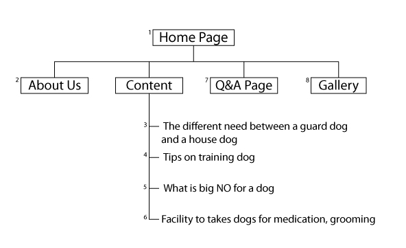
4. 1st task - The different need of guard god and a house dog
5. 2nd task - tips on training the dog
6. 3rd task - What is big NO for a dog
7. 4th task - Facility to takes dogs for medication, grooming.....
8. Outcome - New Pet Owner will fell much more secure with his/her pet
9. Showcase - Gallery


how to make a good 1st impression for Men
1. Who am I - A Guy
2. Who is them - anyone
3. What for - to give a good impression to stranger
4. 1st task - Personal cleanliness
5. 2nd task - Clean and Polished face
6. 3rd task - Hairstyle
7. 4th task - Personal Style
8. Outcome - Feel more confident towards your personal style
9 Showcase - Gallery

how to make your dessert look interesting
1. Who am I - Pastry Chef
2. Who is them - anyone who want to learn simple decoration
3. What for - To teach the audience
4. 1st task - Introduction Tools
5. 2nd task - Fondant
6. 3rd task - Piping technique
7. 4rd task - playing with technique
8. Outcome - Simple technique that can be use by people who didn't go through bakery class
9. Showcase - Gallery

how to make our earth greener
1. Who am I - Adviser
2. Who is them - anyone who want to take action
3. What for - to make the earth a better place
4. 1st task - pollution
5. 2nd task - why?
6. 3rd task - small changes big different
7.4th task - how us can make a different by taking action
8. Outcome - a better environment
9. Showcase - Gallery

Illustrator Tutorial

Illustrator Tutorial 1

They have few interesting tutorial, they have good tips on lighting


Illustrator Tutorial 2

Photoshop Tutorial

http://10steps.sg/
I use few of the tutorials from this website to brush up my photoshop skill,
go under "Learn New Thing" where i create a graffiti work
and also "Practice (Illus cs 4 and Photoshop) where i learn how to create fire words

http://chaoslt.deviantart.com/art/Free-Interface-PSD-Files-79704361


http://www.snap2objects.com/2009/03/09/20-great-tutorials-for-digital-painting/

There are few digital painting tutorials in the site

Beautiful Website

Here are some website that i find beautiful, click on the link to check out more ^^

1.) http://www.krijtenberg.nl/index.php


2.) http://www.meomi.com/


3.) http://www.ispoil.net/

Wednesday, July 7, 2010

Survey Info Graphic

I have created an info graphic that showing the steps of making a pancake. You are welcomed to drop some comments or answer the following simple question on the info graphic. All comments will be appreciated. Thanks.

you can always comment on my facebook wall, or just comment it in the my blog comment box
Please and Thank You


Q1: Does it attract your attention at the first sight?
a) Yes
b) No


Q2: What is the design element that has got your attraction at the 1st view on it?
a) The title
b) The graphic
c) The content typeface


Q3: Do you feel confuse with the graphic?
a) Ya,
b) No ( why )
c) Point out the one u feel not suitable and suggest


Q4: Do you follow up with the sequence of the steps?
a) Ya.
b) No. (comment…)


Q5: Do you think everything is well-arranged for understanding?
a) Yes, sure.
b) No, it looks quite messy


Q6: Does the color combination interesting and contrast enough?
a) Yes, they do.
b) No, I don’t really think so.
c) Suggestion…?


Q7:If you don’t rely on the words, can you understand the meaning of the graphic?
a) Yes.
b) No. (comment…)


that’s all for my survey question, appreciation and gratefulness for your help is in my heart. Thanks for your effort to complete this survey, sincerely. :)

Monday, June 28, 2010

Boom De Ya Da !?!?

This week is my exploration week, meaning 1 week holidays.... can rest for a little
but still there are class to replace and so on........

This is one of my small project for the subject Design Method.....
The project is to visualize a song into an image
and tadaaaaa.....

I choose the song from Discovery Channel.
The tittle of the song is Boom De Ya Da...
love the song !!!


So this is the image from my brain
and also 1st time using digital painting (I think is still consider digital painting)
Everything is digital painted with color reference and real reference


That all i guess ^^
Thank you for reading
Have a great day.....

Monday, May 17, 2010

What Have I Been Up To ??

well my semester break is already over, 1 moth holiday just passed by........
in the holiday i pretty much slacking and relax
I did work for couples of week, but is not biggy... still get to relax~~~


There is 3 books in the picture (ignore the red puppet LOL)
From bottom
1.) Breaking Dawn by Stephenie Meyer
2.) Dear John by Nicholas Sparks
3.) The Curious incident.......... by Mark Haddon

I read these 3 books in the holiday, since I got nothing better to do. So reading is my next best choice of entertainment. All three books is awesome !!! My favorite out of the 3 is "DearJohn" because it have a great story line and unpredictable ending
the others 2 also good.... :)

Now my semester break is over, back to college. And this is our 1st semester home assignment
Draw a self portrait by using Adobe Flash...


Well that all i guess.....
Have a good day ^^V

Sunday, March 28, 2010

Perspective Study

Not that good but i did my best
this is my perspective study assignment ....

my bedroom design (1 point perspective)


My Bungalow House design (2 point perspective)
use 1 and a half day to finish it
but i quite stratified with the outcome ^^

Friday, February 19, 2010

Hmmm Good or Bad?

Photoshop !
Not great but atleast i m happy with the outcome ^^V
This is a CNY home assignment....


Photo Editing
This is freaking hard for me to achieve this.......
Not good in photo editing but i try my best ^^
I just apply what i learn from College and put it here

FUN
This is not part of CNY home assignment .
Learn how to create Linen object by using photoshop
Below is the final outcome ^^V and i like it
After that i create a wallpaper for my desktop
and Ta-Daa the final outcome of the wallpaper ^^V